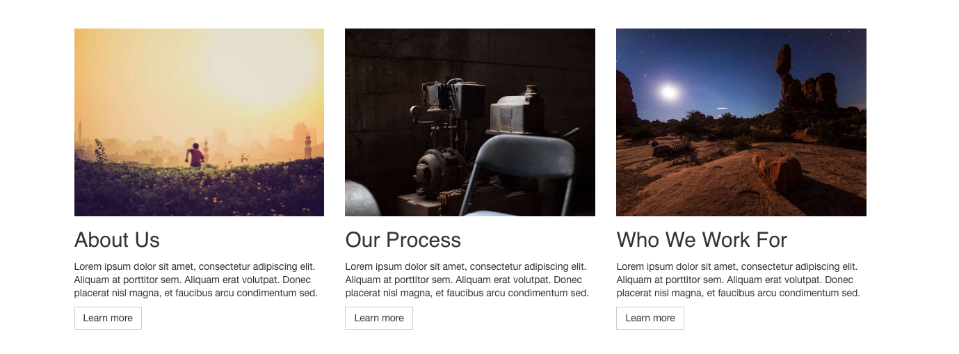
I’m trying to setup responsive images with the imager plugin, that has 100% width on mobile sizes and then the images are in a 3 column grid on tablet and desktop. But although I’ve got the code outputting the three sizes, the browser is only showing the largest one at all sizes. So can someone see what I’ve done wrong in the following code
      {% set image = row.image.first() %}
      {% set transformedImages = craft.imager.transformImage(image,
          [
              { width: 360, ratio: 4/3 },
              { width: 294, ratio: 4/3 },
              { width: 720, ratio: 4/3, jpegQuality: 60 },
          ],
          {
              format: 'jpg',
              allowUpscale: false,
              mode: 'crop',
              jpegQuality: 80,

              interlace: true
          }
      ) %}
      {% if image | length %}
      <img class="img-responsive"
           src="{{ transformedImages[1].url }}"
           sizes="(min-width: 768px) 33vw, 100vw"
           srcset="{{ craft.imager.srcset(transformedImages) }}"
           alt="{{ image.title }}"
           width="100%">
      {% endif %}
I’m assuming it’s to do with the sizes="(min-width: 768px) 33vw, 100vw" So the 360 width is desktop, and the 294 width is tablet, and the largest size of 720 width is mobile to account for the 2x density.
